
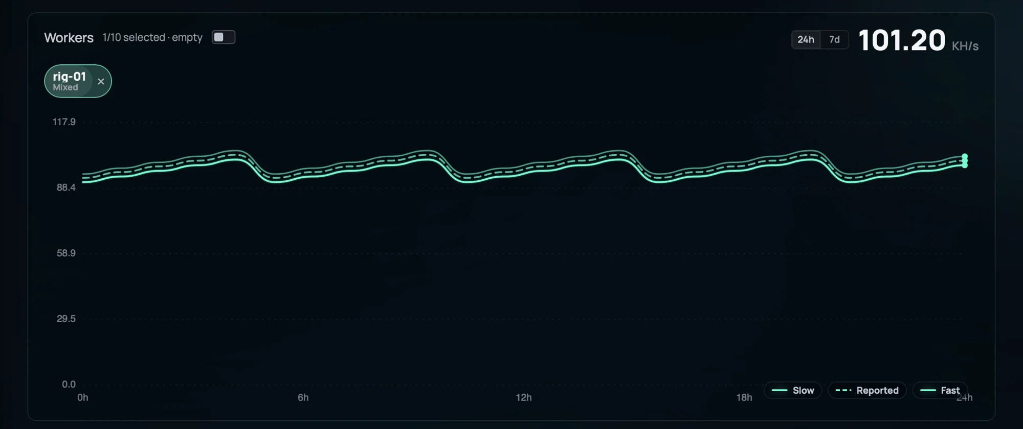
Three lines, three jobs
A short-window estimate. It reacts within minutes, so it shows real changes first — but because it averages over little data it is the noisiest of the three.
A long-window estimate (also called Accurate). It ignores short-term luck and settles close to your true rate. It is calm and reliable, but it lags a genuine change by a while.
Only the number your miner sends about itself, drawn dashed. It appears only if your software reports it, and the pool never pays on it — it is a sanity cross-check against measured work.
Fast is dynamic but noisy
Fast averages over a short window. That lets it surface a genuine change almost immediately, which is what you want when you have just tuned a rig or one dropped offline.
The cost is jitter. With less data in the average, ordinary share-luck shows up as wiggle, so a Fast spike on its own is not proof that anything actually changed.
Slow is calm but lags
Slow averages over a long window, so the same share-luck cancels out and the line stays smooth. It is the closest thing on the chart to your true sustained rate.
Because it weights history heavily, it reacts slowly: a real step up or down takes a few windows to fully show up. Calm and a little behind is the trade.
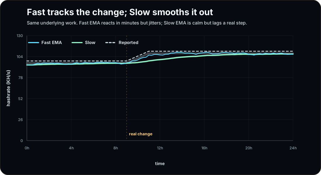
Same underlying work. When the true rate steps up, Fast catches it within the hour but wobbles around it; Slow arrives later but barely jitters. Reported is the miner's own steady claim.
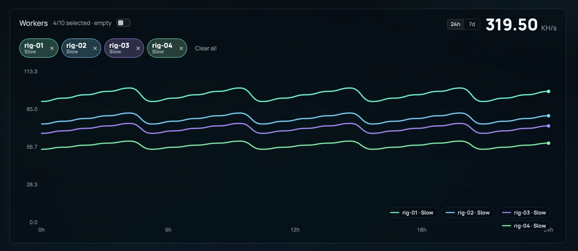
Four rigs, each plotted with its Slow line so the panel stays readable. Switch a single worker into the mixed view to compare its Fast, Slow, and Reported traces.
The Slow line earns its accuracy over time
Hashrate is never measured directly — it is inferred from how often your shares arrive, and share arrivals are random. Right after a worker connects there are only a few of them, so the estimate could be off by a lot. The dashboard tracks this as a confidence value, and the shaded band around the Slow line is its margin: uncertainty = estimate × (1 − confidence).
As shares pile up the confidence climbs and the band closes in on the line. Nothing about your rig changed; the pool simply has enough samples to be sure. That is why a brand-new worker can look erratic for the first little while and then settle down.
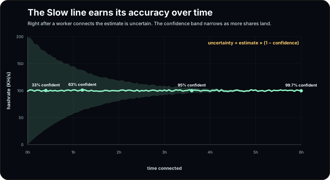
Just after a worker connects, the estimate is barely constrained, so the shaded confidence band is wide. As shares accumulate the band narrows toward the line: uncertainty = estimate × (1 − confidence).
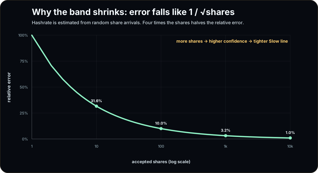
Hashrate is inferred from random share arrivals, so the relative error shrinks with the square root of the share count. Ten shares is roughly ±32%; ten thousand is about ±1%. Four times the shares halves the error.
Reported is what the miner says
The dashed Reported line is not a pool measurement at all — it is the hashrate your mining software chooses to announce about itself. It shows up only when your miner sends one, which is why many charts have just Fast and Slow.
Treat it as a cross-check. If Reported sits well above Slow, the pool is verifying less work than your miner claims to be doing — stale shares, a mismatched difficulty, or an optimistic miner can all cause that. Either way, rewards are scored on measured work, never on the reported number.
Common questions
Which number is my real hashrate?
Slow. It is the steady, statistically-settled estimate the pool trusts for your account. Fast is the same data with less averaging, and Reported is just what your miner claims.
Fast spiked but Slow barely moved — what happened?
Usually short-term luck: a cluster of shares landed close together. Fast reacts to that; Slow waits to see if it persists. If the change is real, Slow follows within a few windows.
Why is the band so wide right after I connect?
The estimate has only seen a handful of shares, so its confidence is low and the uncertainty is large. Give it time on a stable difficulty and the band closes in fast.
My Reported is higher than Slow — am I losing hashrate?
Not necessarily. Reported is your miner's self-measured nameplate; Slow is work the pool actually verified. Stale shares, a too-low difficulty, or an optimistic miner can all open a gap. Payouts follow measured work, not Reported.
There is no Reported line at all.
That trace only appears when your mining software sends a hashrate. Many miners do not, so the chart simply shows Fast and Slow.
Fast and Slow are EMAs Show the formula
Both lines are exponential moving averages of the per-window measured rate. Each new window is blended into the running value by a smoothing factor α.
Fast uses a large α, so recent windows dominate (responsive, noisy). Slow uses a small α, so history dominates (smooth, laggy). Same data, two settings.
The confidence band Show the formula
The shaded band is the estimate scaled by how unsure the pool still is. Confidence runs from 0 to 1, so the band is full-width at connect and vanishes as confidence approaches 1.
The dashboard derives c from how much verified work has accumulated, so the band narrows on its own as you keep mining.
Why error falls like 1 / √N Show the derivation
Share arrivals behave like a Poisson process. The standard error of a Poisson count of N events is √N, so the relative error is √N over N.
So 100 shares is about ±10%, 10,000 shares about ±1%. Quadrupling the shares halves the error — exactly the curve behind the narrowing confidence band.